Menu.
Close.
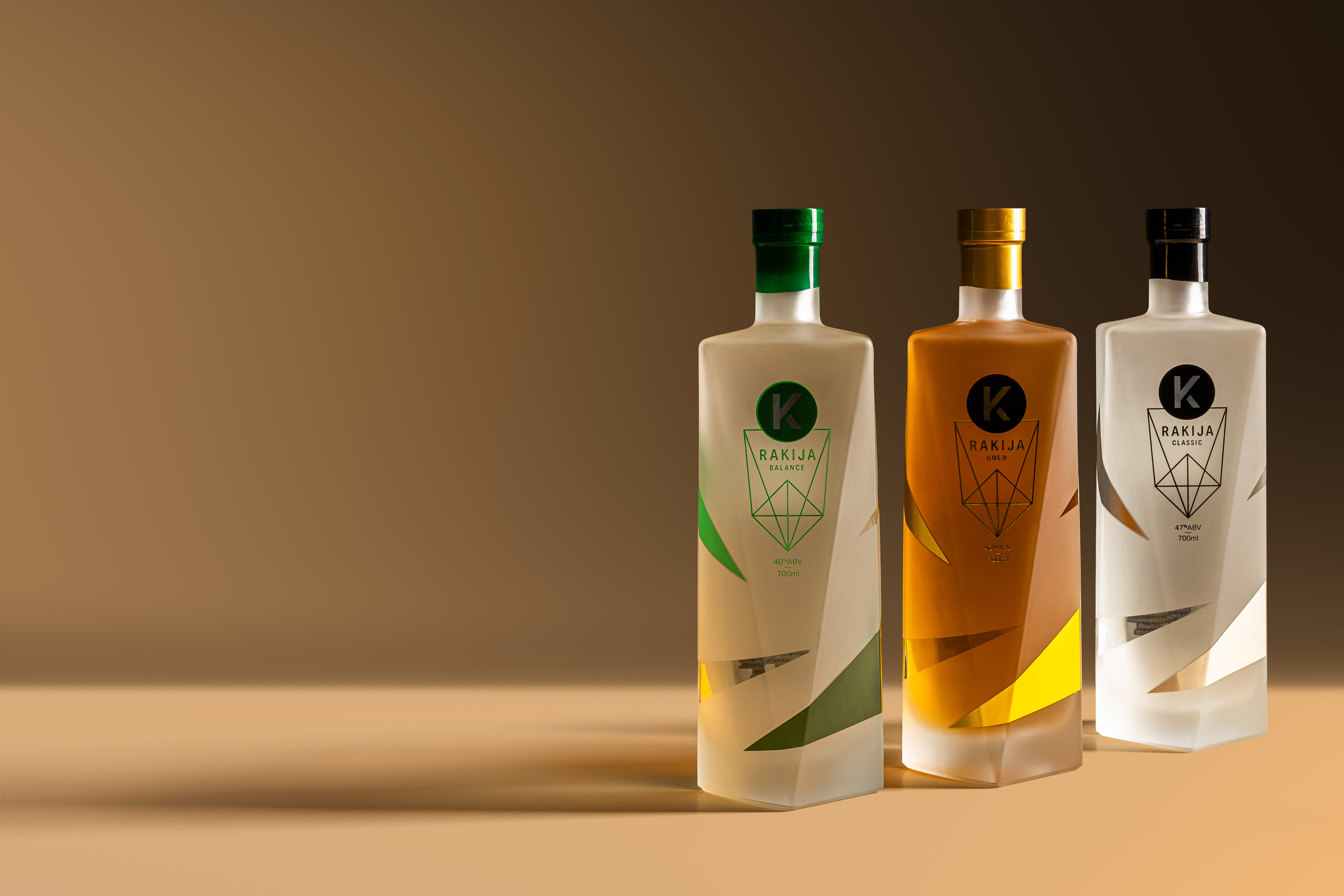
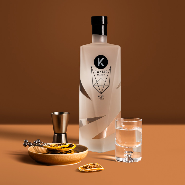
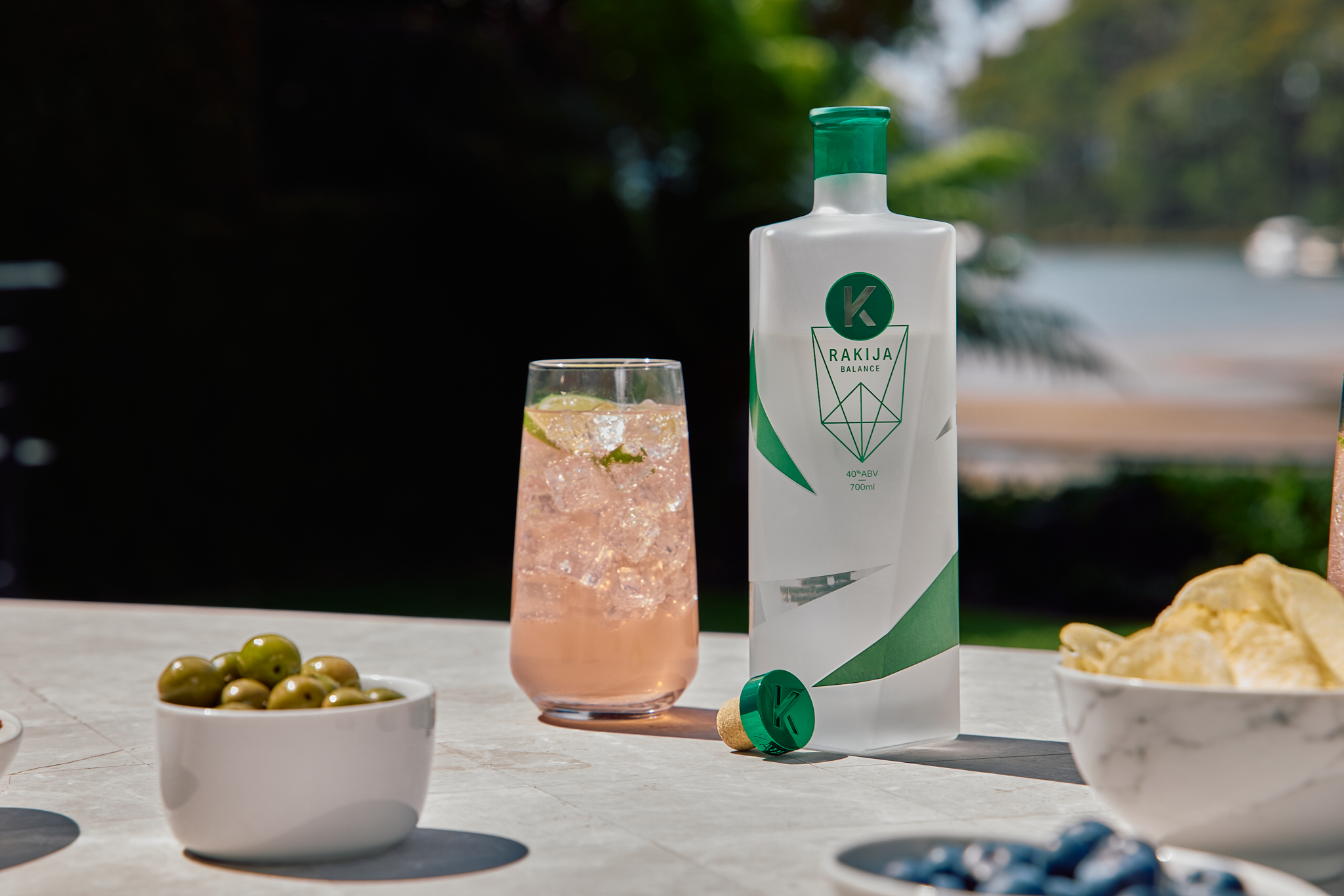
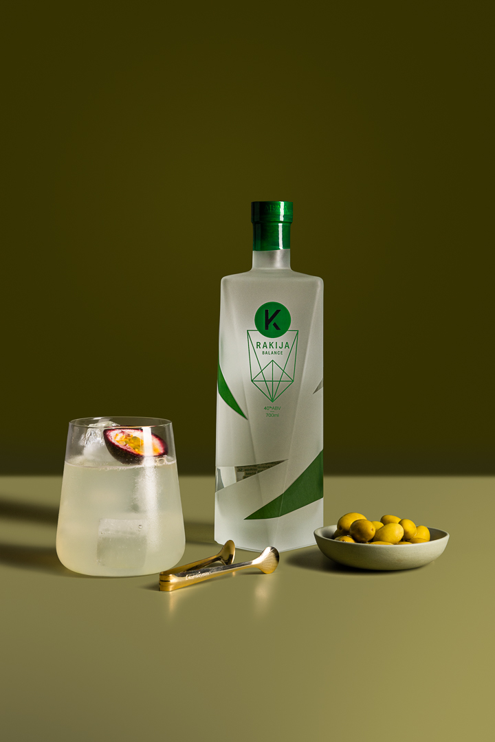
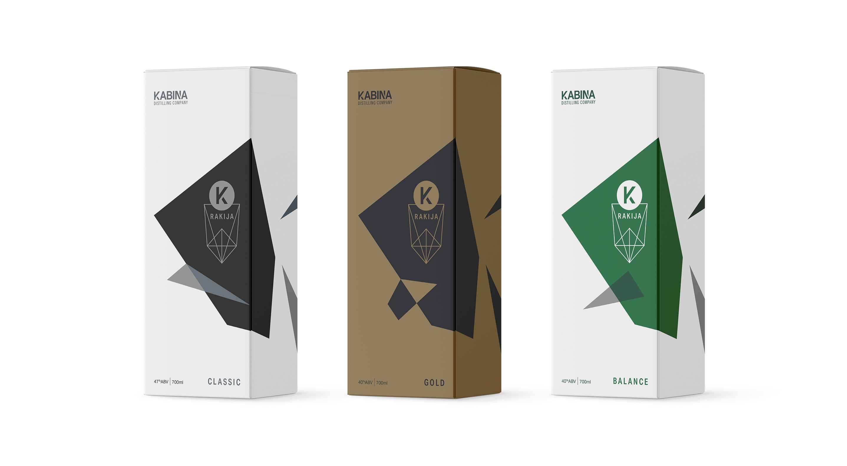
Kabiná’s branding is built around the distinctive, crisp shape and sharp angles of the bottle, making form the identity’s foundation.
The logo and graphic system echo these angular cues, creating a confident, sculptural presence that feels modern and deliberate always.
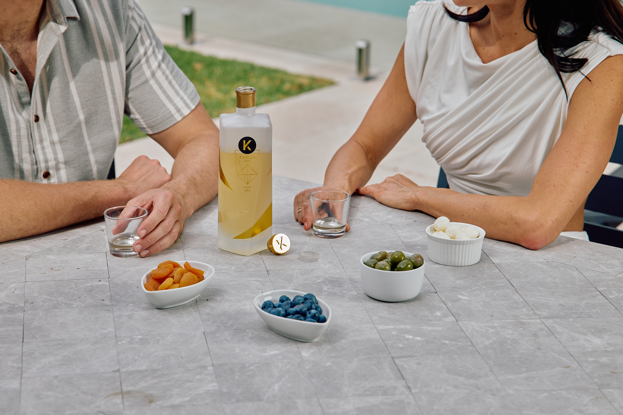
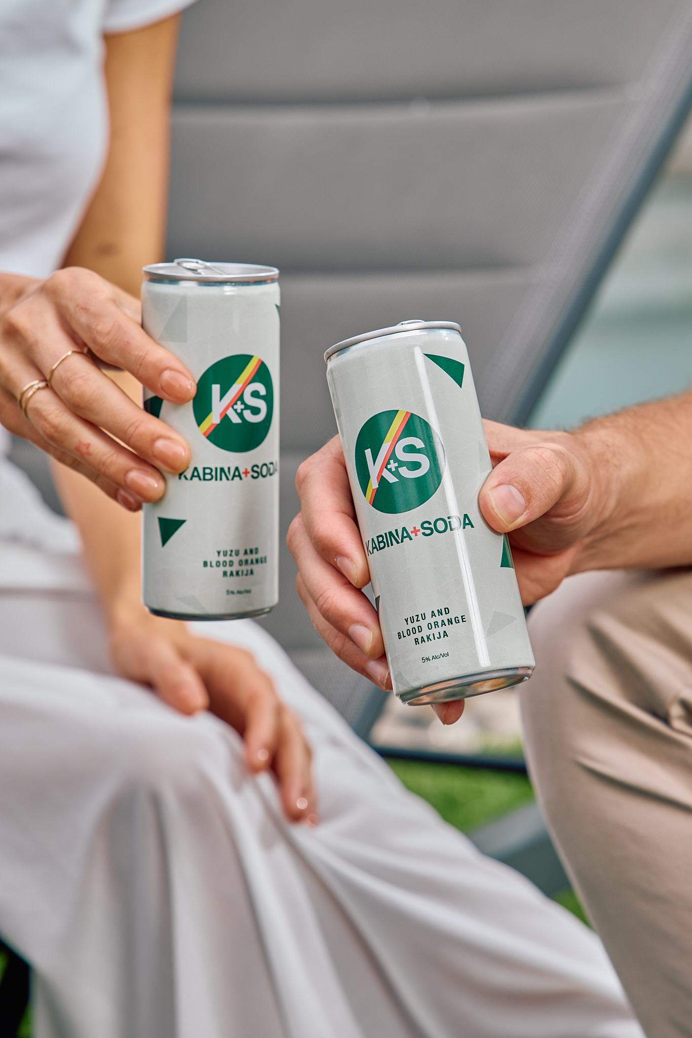
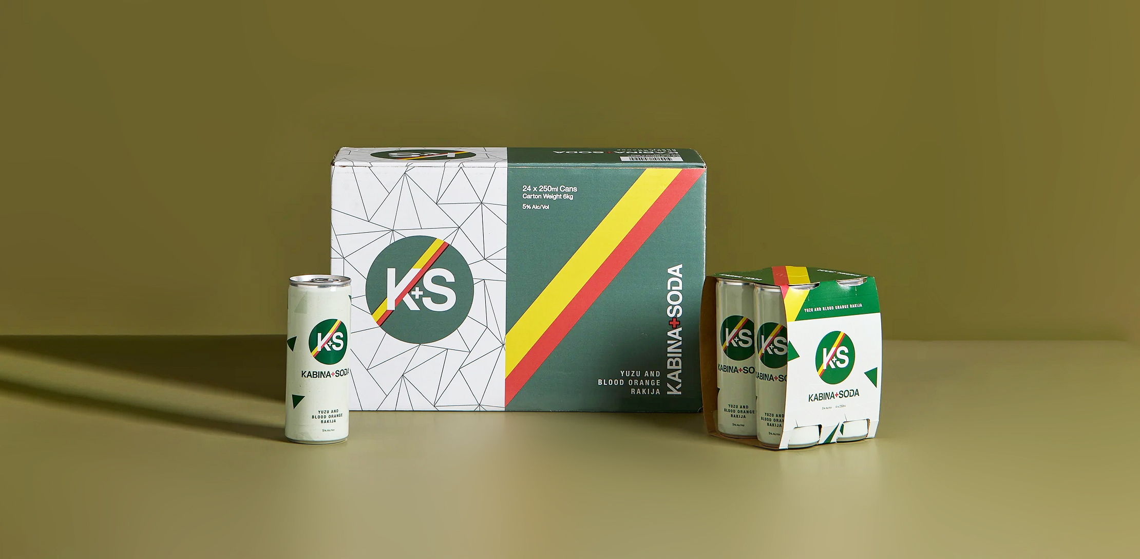
Cans introduce a lighter expression, using bright colour and openness to signal a crisp, refreshing, summer-led attitude across ready-to-drink moments.
Food & Beverage
Identity Design
Print Design
Packaging


Studio Malt is proud to acknowledge the Traditional Owners of the land on which we live and work. We honour and respect their ongoing cultural and spiritual connection to this country. We pay our respects to Elders of the past, present and emerging.
Warehouse 14, 28 Down Street
Collingwood Victoria 3066
03 9421 4700
hello@studiomalt.com.au